
Wild Edibles
The Wild Edibles app redesign is a mobile app design concept based off an existing iOS app. The updated app would allow the user to search for and identify wild edibles on the trail with the ability to add/edit content, share to social media and mark their wild finds on a google map. The goal of the redesign is to fix current user challenges and add practical features that foragers would find useful.
*Disclaimer: This is a project I completed as a design concept. I have no affiliation with Wild Edibles or Sergei Boutenko (Owner)

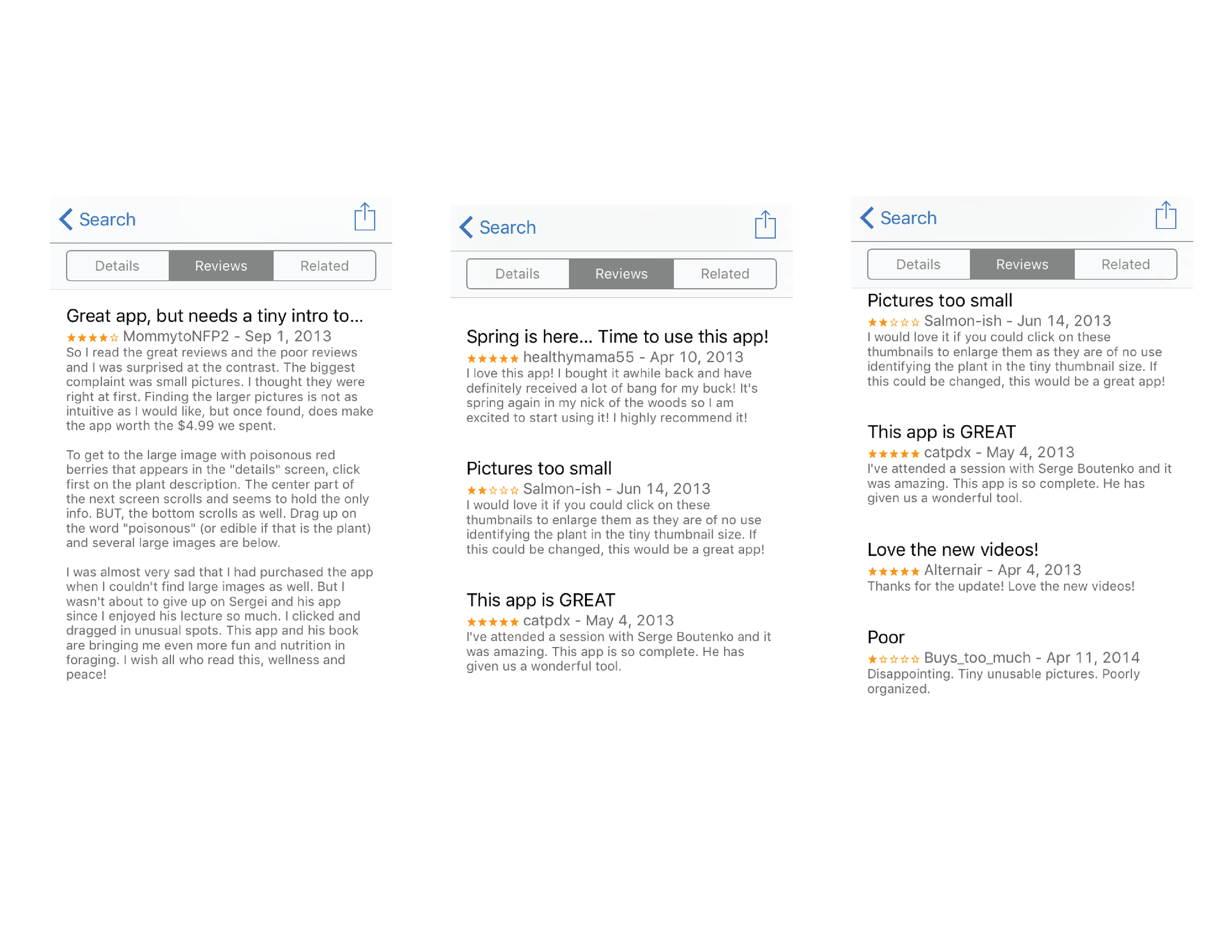
The Problem
Although the information provided by the app was valuable, the app needed visual and interaction updating. This was indicated by mixed reviews on the app store. Users loved the quality of the information provided but at the same time certain user interactions consistently failed, frustrating the user.
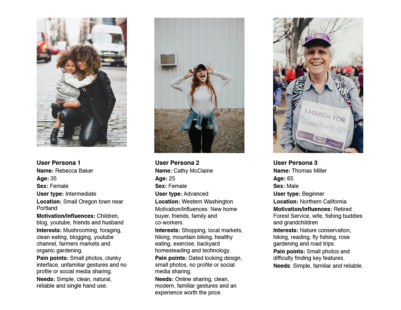
User Personas
The target user groups were determined by buying habits and comments from app reviewers. Mainly teachers, nature enthusiast, homesteaders, hikers and researchers from the ages of 19 to 65.
Based on this information three main user groups were decided and the personas below were established.
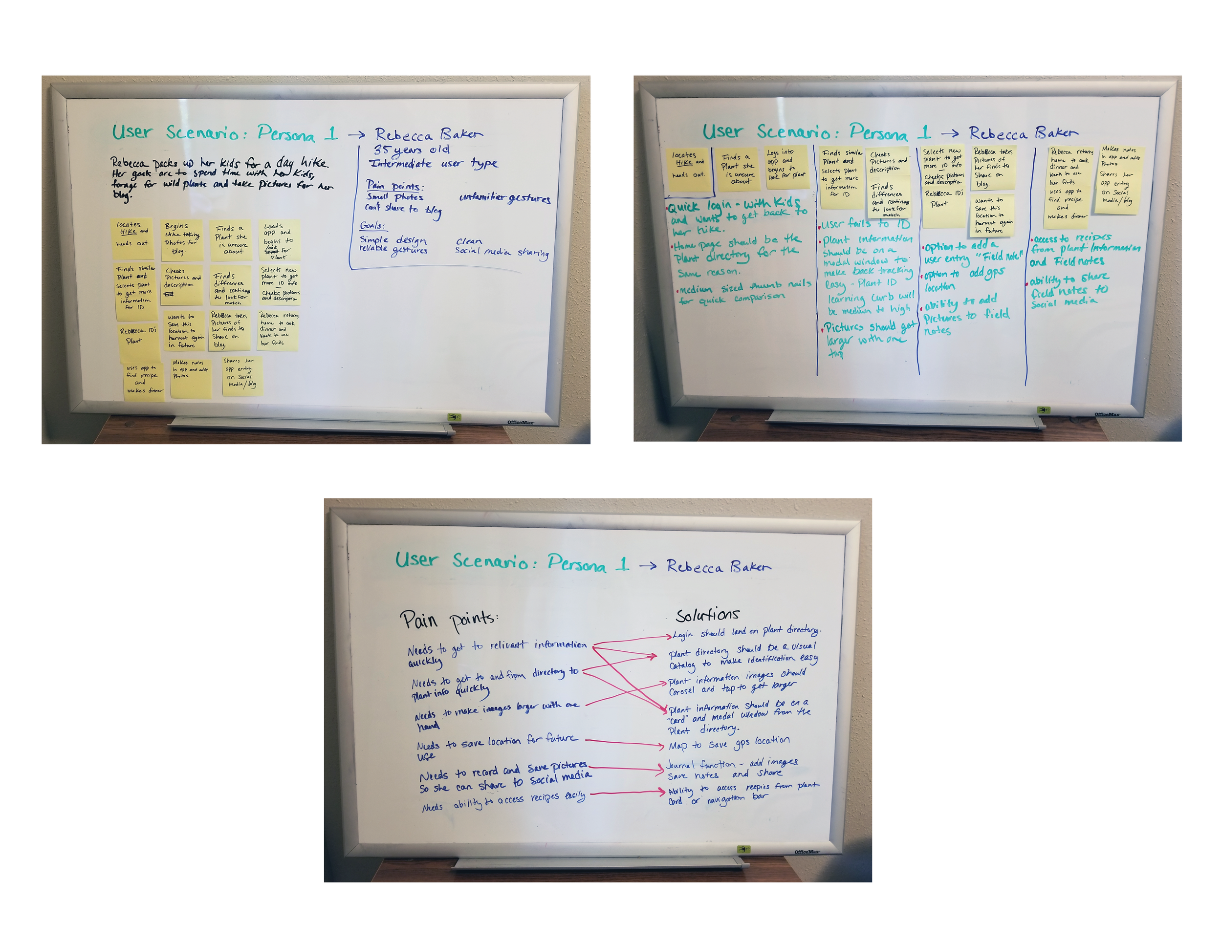
Persona Scenario
In the images below I walked our user persona, Rebecca Baker, through a scenario to decide her pain points and ensure that all user interaction with the app would have solutions.
The Scenario:
Rebecca packs up her kids and takes them out on a day hike. Her goals for this trip are to spend time with her kids outdoors, take pictures for her blog and find some wild plants to maybe add to dinner tonight.
Via the sticky notes, I establish the steps needed for Rebecca to complete her goals for the day. This process helps establish pain points and user needs. Based off the pain points, and Rebecca's goals, we can decide on features for the app, how certain interactions should potentially behave, and how to solve problems specific to Rebeccas needs.
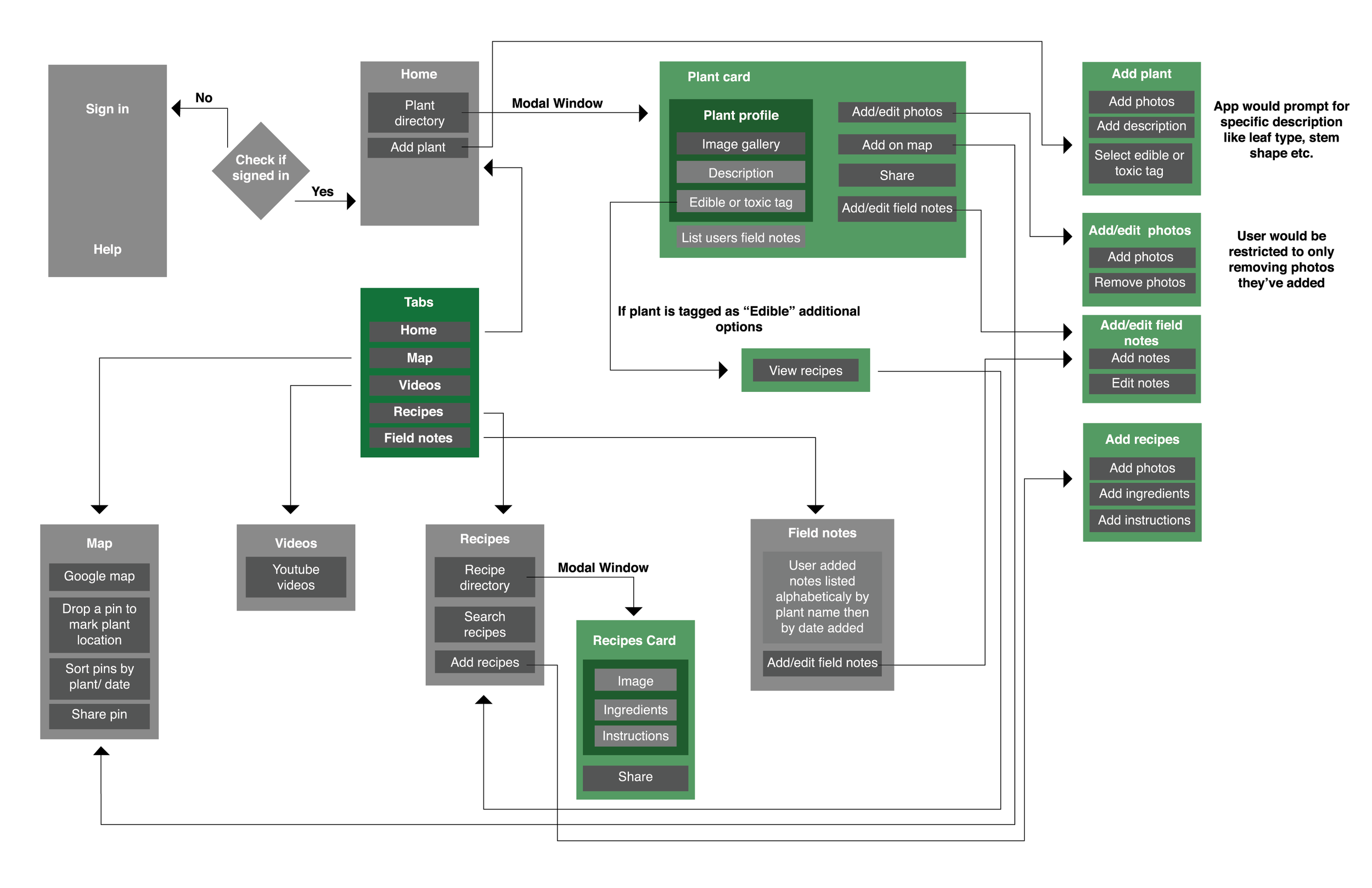
UI Architecture
After determining pain points and user needs for each of the personas, a list of features for the app quickly emerged.
Based on the established user needs, content and features were prioritized within the UI architecture.
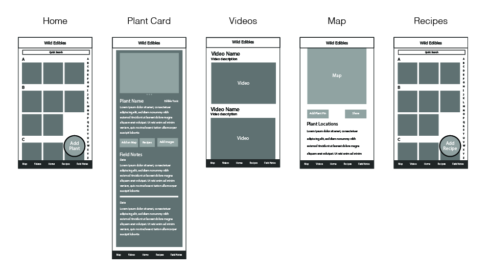
Wireframes
I developed a basic wireframe direction for the navigation bar pages in order to test user flows and identify navigation issues early on.

Visual Design
Click here for an interactive preview of the app.
The UX process I used during this project included:
Brainstorming Sessions
Personas
Storyboarding
Journey Mapping
User Flows
Wireframing
Prototyping
Usability Testing Inperson